
I have a love/hate relationship with paint colors. Just looking at a fan deck can set off a maelstrom. I become indecisive, rash, conservative, edgy, remorseful. And, I fall in love too easily with inappropriate hues.

So when my husband gave me a "honey do" list for our house-to-be, Rattlebridge Farm,
and "paint brick exterior" was item number one, I felt elated and angsty.
No, we wouldn't paint it ourselves (we're out of shape Baby Boomers, plus we're skittish of tall ladders), but I'd need to get estimates and select exterior colors.
In theory, I love the process, even though I dither for weeks over paint decks, comparing near-identical shades of beige. Sometimes a bold fit will sweep through me, and I'll paint a room terra cotta or chocolate. Or I'll pick something safe. I am still shell-shocked from choosing a neutral stucco color for our present home. This happened years ago, but I can still remember how my hands shook when I selected a creamy shade from a tiny sample card. I'd assumed the color would be true, but I ended up with a house that resembled royal icing.
Time and dirt has given the stucco a lovely patina, thank goodness. However,
I learned two lessons:
1) Color chips lie.
2) Outdoor light transforms colors--drastically.
All these years later, here I am, facing another paint dilemma, so I did homework. Which color will work on our brick? Should it be bold or neutral?
Maybe I should add soft color? I love blue shutters.
Traditional colors are timeless and elegant. I can't go wrong with this combo.
Or I could make a smallish, but significant statement.
Decisions, decisions.
After studying the fan deck, I drove to the paint store. Sherwin Williams has a "Nashville" collection, and I was drawn to Tennessee Limestone (which resembles Amazing Gray) and Cumberland (close to Halcyon Green).
Zap plopped down on the color folder, right over Belle Meade Green.


I also liked Ramie, which appeared to be a warm, not-too-dark beige.
I bought small sample tubs and made a crude color board. But when I painted samples, I had misgivings about defiling the pretty bricks. Plus, the colors (surprise!) didn't match the paint chips. Ramie (left) turned out to be a pretty shade of yellow, and Tennessee Limestone (right) was a cool, chalky white.

I started eliminating colors.

I came up with a plan. What about tinkering with Tennessee Limestone and pairing it with either Urbane Bronze or Cumberland (aqua)?

From the top: Ramie, Tennessee Limestone,
and Tinkered Tennessee Limestone (bottom):
and Tinkered Tennessee Limestone (bottom):

The tinkered mix turned out to be neutral and creamy, not too dark and not too light. I'd found the paint color for the bricks. But what about shutters?
I'd envisioned something different for Rattlebridge. It's a farm, hemmed in by two creeks and a pond. Wouldn't aqua or blue-green be lovely for the shutters? What about Cumberland? Surely it could hold up against the tinkered Limestone.
Just to be safe, I also got a few other samples. I started with Belle Meade Green, which my husband loved, but it looked navy. I'd been hoping for a deep, dark green.
Tricorn Black seemed harsh. I'm not sure why.
By the time I painted a swatch of Urbane Bronze, an icy wind was kicking up, and I only painted a thin coat (bottom photo).

I wasn't pleased with the results.
I cannot control the light
or those liar-liar-pants-on-fire paint chip colors.
Of the three colors, Urbane Bronze seemed like the best choice. But I wanted to keep looking.

Allison thought Cumberland was pretty but a tad beachy (after all, Rattlebridge is in Tennessee). Belle Meade Green looked navy to her, too. I kept clinging to Cumberland.
Here's the thing about dark shutters. From the road, a dark blue-green like
Belle Meade Green
will appear black.
The eye slides right over dark shutter colors and registers them as pleasing; but people will notice pastel or strong shutters. It's a love/hate thing.
Belle Meade Green
will appear black.
The eye slides right over dark shutter colors and registers them as pleasing; but people will notice pastel or strong shutters. It's a love/hate thing.
Shutter color (or any color, really) comes down to two things:
Do you want to be safe
or
do you want to take a risk?
If you love risky color, you must love that color, then be confident in your choice and ignore the inevitable criticism.
But what if you are married to the critic?
or
do you want to take a risk?
If you love risky color, you must love that color, then be confident in your choice and ignore the inevitable criticism.
But what if you are married to the critic?
My husband voted for Belle Meade Green but agreed that Tricorn Black was too much of a contrast for the house and setting. He thought Cumberland was too "girly."
Allison always discovers things I miss, and she said that Urbane Bronze would work with the setting and the coppery-brown gutters.
I'm thinking board-and-batten shutters will add a rustic touch to the painted brick house.
The wildness in me longed to tinker with Cumberland, so I did. The result was way too green.
My Yorkies are still ailing, and I won't spend hours in a paint store, searching for the perfect shade of pale blue. Also, let's be really real: I would go through twenty of those little $6 paint tubs. Even then, I might not find a tint that can handle the light and shadows at Rattlebridge.
I'd hoped to pick an audacious color, but I'm caving. The shutters will be Urbane Bronze. And I'm content. Besides, I've got to prepare for an Upcoming Color Dilemma.
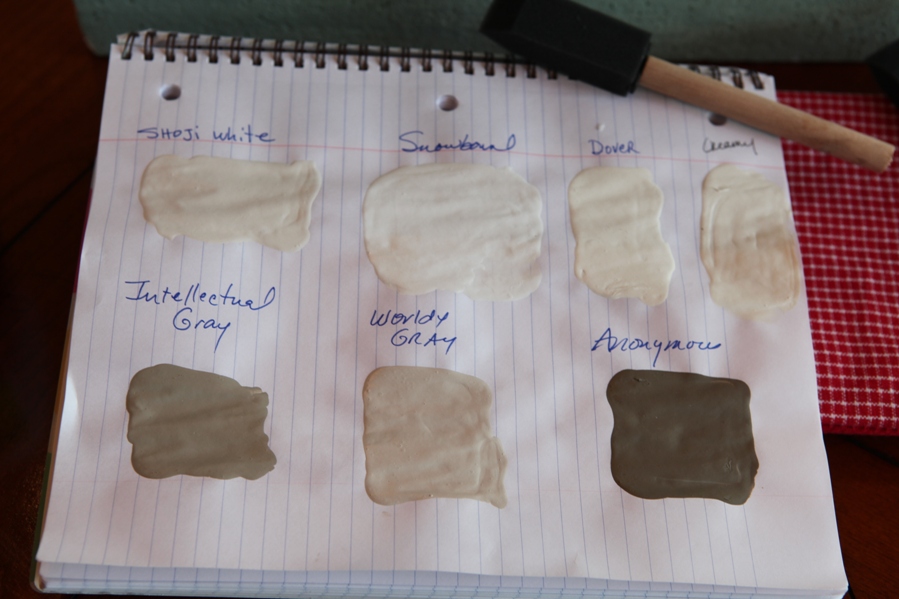
I'm testing colors for the foyer.
It's a small, dark place, but white paint and a glass door will brighten the area. SW's Snowbound is a front-runner. It's creamy yet neutral. Pure White looks promising, too.
Shoji White might work in an adjacent room. But I am loving Snowbound.
It's a small, dark place, but white paint and a glass door will brighten the area. SW's Snowbound is a front-runner. It's creamy yet neutral. Pure White looks promising, too.
Shoji White might work in an adjacent room. But I am loving Snowbound.
That's the crux of paint--the DIY decorator must test samples
and study them in all kinds of light.
Then, if you are very, very lucky, and if the stars and moon are aligned, you might find a color that pleases your eye, soothes your loved ones, and works with your space.

No comments:
Post a Comment