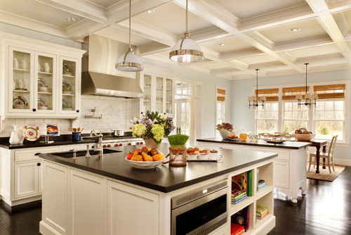
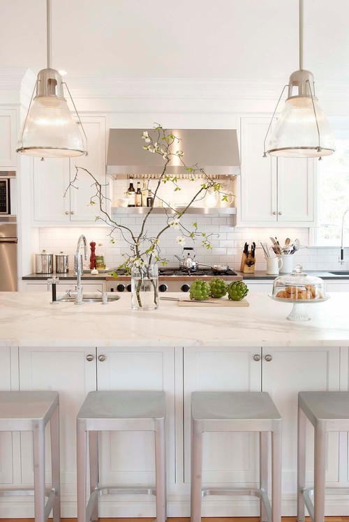
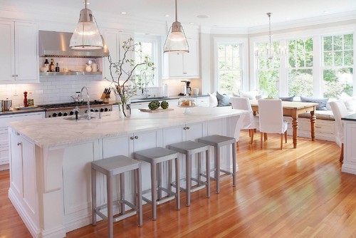
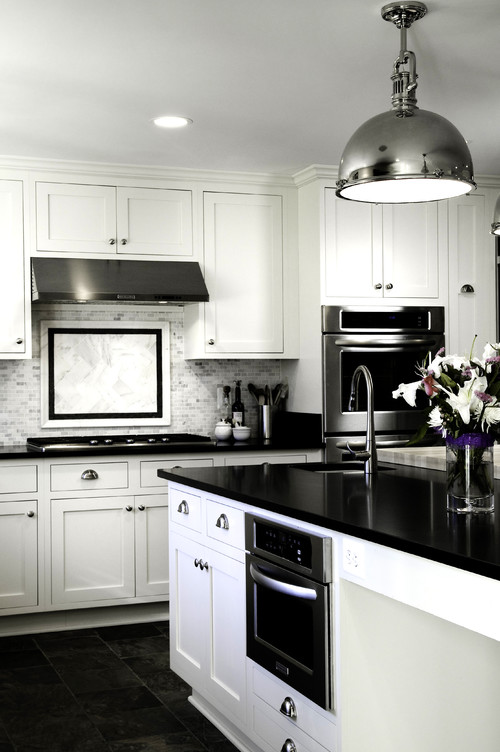
Showing posts with label white paint colors. Show all posts

Monday, August 4, 2014

Do Foolproof White Paint Colors Exist?


 On this hot, sunny Monday, I'm neither weeding nor cooking. 
I'm paint sleuthing again, on the prowl for foolproof neutral colors.


6 Foolproof Whites
and
3 Popular Off-Whites and Greiges

How can such a thing exist, given the unique characteristics in every home? Stormy weather can turn the perfect white into a moody, shadowy beast. Sunshine can add a glow to cold, blinding white walls. A room that faces a shady, covered porch may not look brighter if the walls are white. Trim colors must be chosen with care: warm white woodwork might seem murky against cool, creamy walls. Assertive floor coloring, such as orange or peach-toned tile, can hijack a room's color.

It's enough to make a girl cry--or eat lots of cupcakes.

I visited two local paint stores and returned with a list of dependable whites (depending on your room's colors and light exposure, of course).

1. Benjamin Moore Linen White

This warm white makes me think of freshly washed vintage sheets hanging on a clothes line, faintly colored by time. It's the go-to color when your head is spinning with whites and off-whites. Linen White has a reputation for behaving well in all types of lighting situations. Put it on the ceiling, walls, or trim to add instant character and "age."
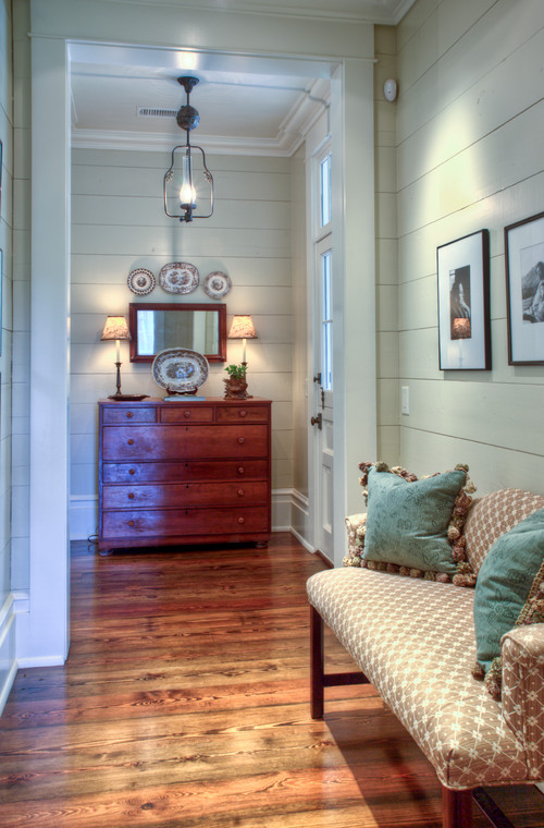
Hand's down, it's one of the most popular white colors. I've never used it, but I'm tempted. Below, the foyer walls are painted BM Linen White in an eggshell finish. The trim is BM Super White in semi-gloss. The dark wood provides a striking, pleasing contrast to this creamy white.


2. Benjamin Moore White Dove

An amazing, soft white that is cool and warm, depending on where you use this color and what you put around it. The BM website calls White Dove a "perfectly neutral white." The slight gray undertone creates a color that's easy going and plays well with other colors.

Below, BM White Dove was painted on the trim and ceiling.


BM White Dove on the walls, trim, and ceiling (Western exposure).


3. Benjamin Moore Cotton Balls

Cotton Balls reminds me of freshly poured cream. It is a warm (yet cool) color that feels clean. Thanks to yellow undertones, the color rarely seems too-white.

BM Cotton Balls in semi-gloss:

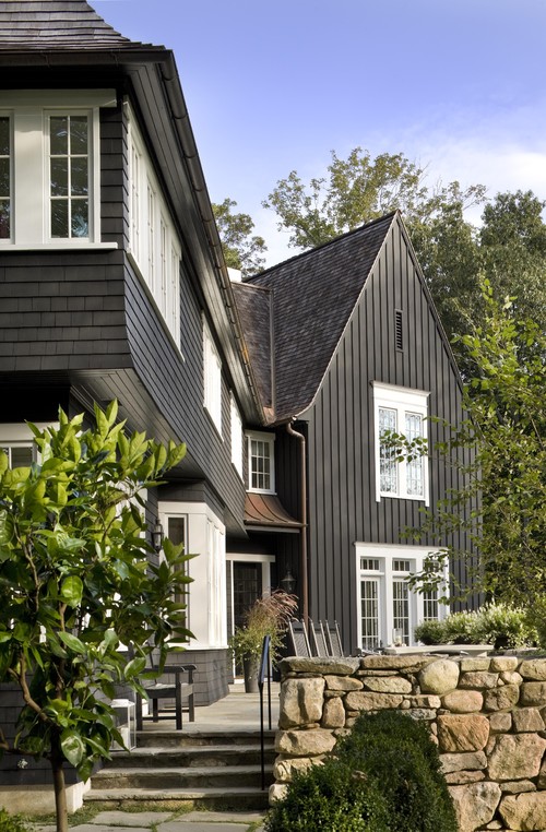
Cotton Balls looks crisp and pristine--but not overwhelmingly white--when it's used on a gray-shingled house.


4. Benjamin Moore Decorators White

With blue-gray undertones, Decorators White is cool, crisp, and clean. It pairs beautifully with
marble and performs well in sunny rooms or as the backdrop for art.


5. Benjamin Moore China White

Thanks to the gray undertones in China White, the color reads white but it isn't stark. If you are looking for a soft, chalky color, this may be the one.

You can see gorgeous example of a China White kitchen that was designed by Michael S. Smith by clicking HERE.


6. Benjamin Moore Simply White

 Simply White is another cool-warm white that has a reputation for being neutral. The green undertones never read "green" or muddy.

Simply White on the walls (eggshell), trim(satin), and ceiling (flat on Sheetrock; satin on woodwork).


3 Popular off-whites and greiges:

1. Benjamin Moore Elephant Tusk

The green undertones in Elephant Tusk create a splendid warm greige. The color is almost cream, but not quite. If it's too yellow, tone it down with white. Below, the formula was doubled for Elephant Tusk because it was painted on wood rather than Sheetrock.


2. Sherwin Williams Creamy 

The name fits perfectly. This warm, off-white is soft and happy, a pretty
white. It's the color of Devon cream. In person, it appears to be a creamy white. However, the yellow undertones show up in photographs.

Here is Creamy (walls and trim) in a room with an eastern and southern exposure:


*
#2 Benjamin Moore Winds Breath

A pleasing warm greige. Here, it is paired with BM Simply White on the trim.

Here, we have BM Winds Breath on the walls (trim unknown). It pairs well with BM Palladian Blue (you can see it in the adjacent room).


#3 Benjamin Moore Ballet White 

Ballet White is another color that the BM site refers to as a "perfect neutral white." It's definitely not white, though, with its complex range that changes colors with the light, moving from grey to beige to cream and back to grey. 

In a room with northern and eastern light, Ballet White looks like a creamy latte.


In the same room, the walls look gray and beige at the same time,
doubtlessly influenced by the white Macabus granite on the counter.


**
 I've only scratched the surface of white and off-white paint colors. I left out the ever-popular Cloud White by BM and Shoji White by SW, along with so many others.

Do you have a go-to white or off-white paint color?
Has a color performed badly in your home? 
What's your favorite trim color?


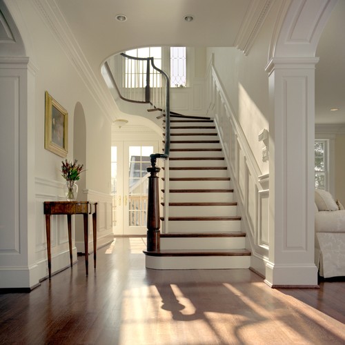
Note: The paint color in the top photo (staircase) is Porter Paints Sea Sand and the trim is Porter's Antique White. Porter was bought by Pittsburg Paints, but I'm not sure if the old PP colors are still available.


Resources for information about paint colors:
Benjamin Moore
Houzz
Pinterest


Metamorphosis Monday contribution.

Sunday, May 19, 2013

Creating a White Kitchen

 
"So we're getting another white kitchen?" Will asked me today, when we were playing with hardware at Rattlebridge Farm.  He was referring to kitchens in previous homes--a stucco Georgian and a "four square" ex-funeral parlor. One was all white, and the other was cream with black and green accents.
 
"Are you okay with that?" I asked.
 
"I'm going to trust you on this one," he said. "You're the cook!"
 
It might be a mistake to trust me with design.
Before we remodeled the kitchen, I elected to keep the original cabinets to keep the cost down, and because the cabinets were perfectly all right. No, the doors weren't inset. But I couldn't justify the expense. As it happened, we ran into a bit of a layout problem because A) the vent was aligned between the beams, but the range wasn't aligned (my contractor noticed this), and B) I wanted two ovens.


I know. Why all this fuss for a bit of a skewed arrangement and especially for two ovens?

My mom cooked memorable family meals with a single oven and no dishwasher. But my present home has two ovens, and they get daily use. I could foresee many arguments with Bandwidth.
Adding to the dilemma, the footprint was tight.

After a bit of shuffling, we revised the layout. 

On the stove wall, we planned a new hood, upper cabinets, and lowers, including two pull out spice drawers. The wall oven and microwave will be relocated and we'll have cabinets and a counter. The island will be extended so we can add counter stools.

The rest of the cabinets will stay, but they'll get new hardware.

The new cabinets arrived last week. I snapped a few grainy pictures with my iPhone. I've been
busy writing, and I've let things slide. However, home things always recharge my writing
batteries and vice versa, so I'm ready to plow ahead, even though a few things are up in the air.
Sorry for the grainy iPhone photos, but they offer a peek:
 

The top cabinet will have slots for my baking pans.

The appliances have been ordered. Now it's time to choose a cabinet color, which means I must also consider trim, wall color, knobs and pulls, material for counters (granite or marble), and back- splashes (subway tile or beadboard or a combination). I'd planned to use SW's "Creamy" on the cabinets, since I've used it everywhere else.

But the kitchen receives warm afternoon light, and "Creamy," which is a warm white, looks very  creamy.

Would it be a design gaffe to use a cool white in the kitchen when "Creamy" was in adjoining rooms?What to do.  When Will and I were building our present home, I visited Gardenweb's Kitchen forum (and many others) to educate myself about layout, appliances, hardware, paint colors, and everything else.

Hand's down, Benjamin Moore's "Simply White" seems to be the new favorite for a neutral, yet warm white. Many homeowners say that it has one drop of black. Others say it's crisp and reads white, yet it's not cold. Some people believe it has a very faint green tint.

At least I've narrowed my choices: "Simply White" vs "Creamy" for the cabinets.

I found a few photos at Houzz.

Here, the cabinets have been painted BM's "Simply White." The lovely wall color is Farrow and Ball's "Stoney Ground."


I found many examples of SW's "Creamy" on the cabinets. Here's one. It "reads" white. It would look very pretty with a warm granite. However, I'd planned to use a lighter granite, possible with black or gray movement or even (gulp) marble. I have not ruled out Absolute Black, which I used in another kitchen, and that stone was bulletproof. (I'll report soon about my adventures in the stone yard.)

SW "Creamy"


I was so confused, so I assembled a white kitchen dream book.

SW"s Eider White. Wall color is Sherwin Williams Anew Gray SW7030


Behr Premium Plus Ultra, Ultra Pure White UL260-14.


BM "Cloud White" on the cabs. Backsplash is Walker Zanger, Grammercy Park--color "Heirloom White" (2x6). Carrera marble on the counters.
Traditional Kitchen by Minneapolis Interior Designer RLH Studio


A few years ago, BM's "Cloud White" was a popular choice for white cabinets.
Maria Killam explains why it's no longer the "go-to" color.

 
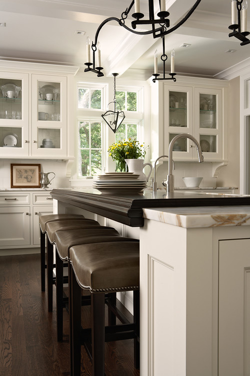
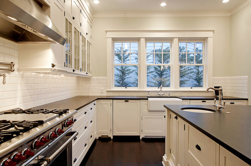
I always smile when I see a "Something's Gotta Give" inspired kitchen, known on the Kitchen Forum as the OTK--One True Kitchen. Here, the cabinets are BM's Decorator's White, and black granite (Cambrian Black with an antique finish) was used on the counters, rather than soapstone. Details include the pro range, black hardware, and a 3 x 6 subway tile backsplash. BM's In this photograph, BM's "Woodlawn Blue" brightened the walls.


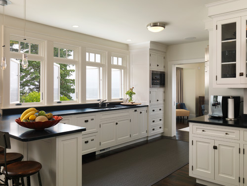
Yet I love the peace of an all-white kitchen. Details: 1 1/4" "Aubrey" knobs (Restoration Hardware). Cabinets are BM "Pure White " and walls are "Edgecomb Grey"; subway tiles are classic white.


A white and black kitchen with cool undertones.


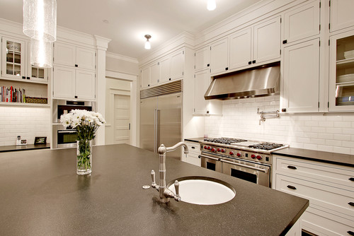
This black-and-white kitchen feels warmer. It's another spin on the "Something's Gotta Give" look. BM "Cloud White" on the cabs. Absolute Black granite counters (they look honed). Subway tile is Ann Sacks' Cappricio White Gloss. Love the wall color,   B. Moore OC-140, "Morning Dew."
Traditional Kitchen by Seattle Architect Paul Moon Design

The hardware is from Restoration Hardware.
Traditional Kitchen by Seattle Architect Paul Moon Design


A previous kitchen was white-and-black, and it certainly had its pluses and minuses. Our present
kitchen cabinets have a maple-like finish.

 
Quite a change!
 
 
What's your favorite white paint?