A white Christmas arrived a day late, stirring up childlike excitement at Rattlebridge. I stepped outside to take pictures of the flurries and heard gunshots, so I ran back into the warm, colorful mess that I call home.
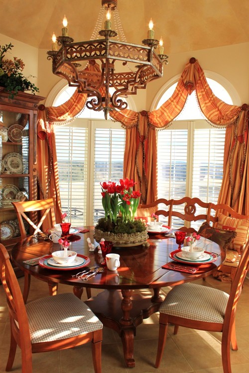
Here, I've completely ignored the tangerine hues
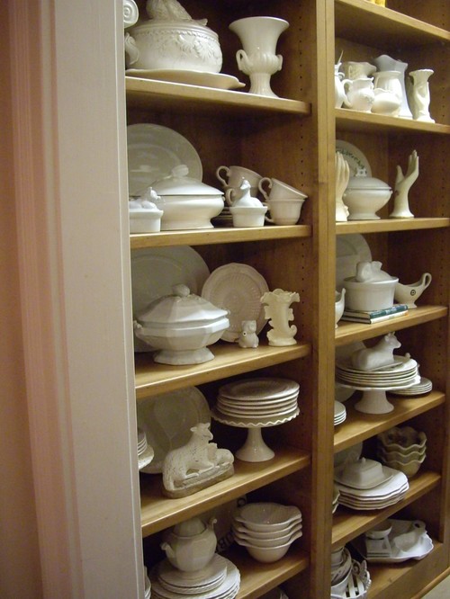
and set the table with red and blue pottery. But in my heart, I'm a white ironstone sort of girl.
My love for white dishes has grown into a love for white surroundings. I am the only girl in this male-dominated environment. My guys aren't neat-nicks. Rather, they're ex-frat boy types (think Animal House minus the food fights) who have advanced university degrees but can't operate a dishwasher.
It's no wonder that I've been dreaming about a white farmhouse. Creamy whites convey peace, order, and fresh starts.
But it's challenging to create white/neutral interiors. I'm reminded of Ahab's quest for Moby (it's no accident that Melville used color as a metaphor in his novel). How to attain warmth when you're swimming in ambient white?
In the early 1970s, I studied design, and the "rules" were simple. Colors had staying power; fads came and went a lot slower.
I occasionally saw white rooms, but they were anchored with
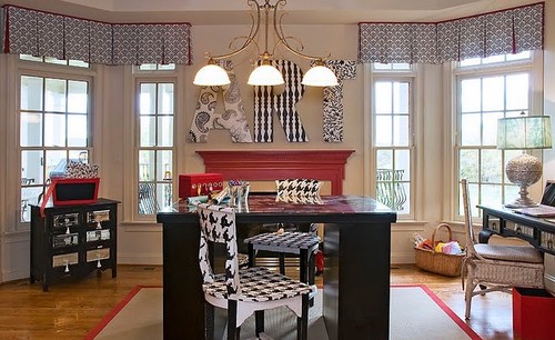
black-and-white houndstooth upholstery, plus the addition
of one color--red, green, or yellow.
That rule still applies. And houndstooth is a classic, can't-go-wrong fabric. But now it's almost 2013, and I can't keep up the the "rules." I just know that I long for clean, uncluttered spaces, but I also know it's not easy to pull a (somewhat) white room together.
I've read all of the tips and rules: Warm whites shouldn't be paired with cooler ones. Pay attention to texture.
Don't mix this and that or ninja rats will attack.
Blah, blah, blah humbug.
It's so confusing.
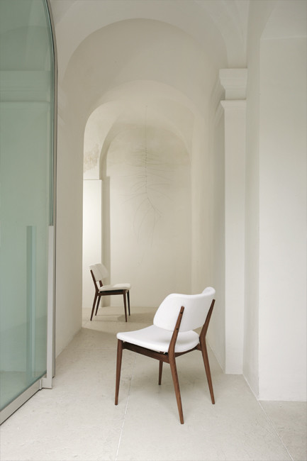
But the best way to learn is to study white spaces. Let your eye rove around the picture. How does the room make you feel? What do you like--wall color, sofa design, accessories, natural light? How do subtle details make or break a room? What would you add? Could you live in that space?
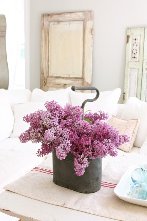
Fresh flowers add a punch of color, to be sure, but don't phone that in just yet. A white room needs more than blue jars and lilacs. But what are those nebulous "things?"
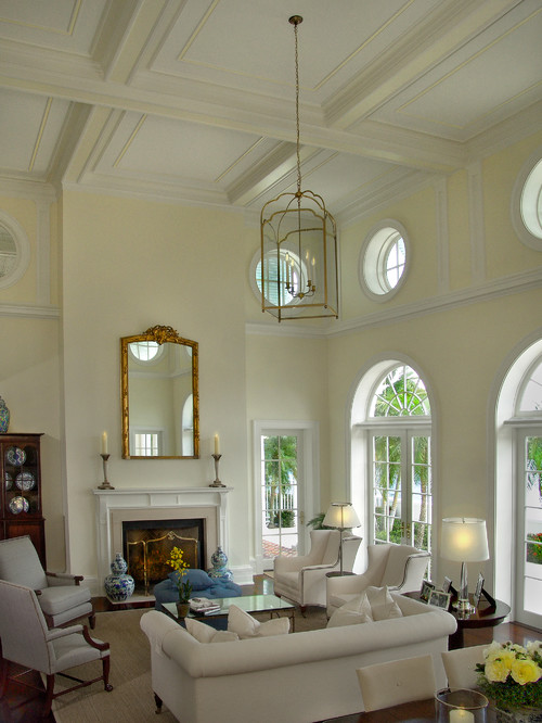
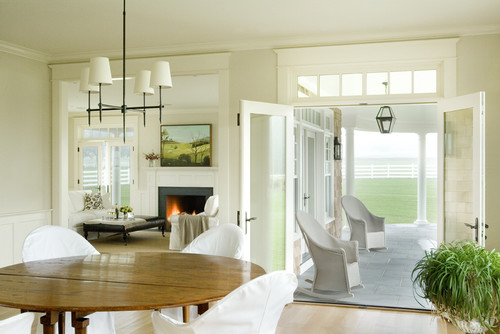
Here is a neutral room.
Could I love here? With that view? Yes!
I have lusted after a white sofa/chairs for decades. I like the white/lemony walls. Love the dark floors and dark wooden furniture. The unadorned windows bring nature inside. The blue-and-white porcelain evokes images of the sky and clouds; I like the blue dishes in the antique display cabinet, too. Yellow flowers add the warmth of the sun. A sisal adds texture.
I like how gold touches repeat in the chandelier, fireplace screen, and mirror. The room isn't cluttered, but I like the accessories, especially family photos on the end table.
What would I add?
One more accessory on the mantel (I believe in the "rule of three," as in Goldilocks and her trio of bears).
A disclosure: I love blue/white/and yellow rooms, but they're not really "my" colors. That said, if I lived here, I'd add colorful pillows. And a Yorkie. :-)
During the holidays I showed renovation photos to a family member (who wishes to remain anonymous). In my mind's eye, I saw a future white room--a place with dogs and color:
And the unnamed [but kind and well-meaning] person saw this:
She saw a white blizzard...
cold and clinical ...
A place where a surgeon would feel welcome.
"But look," I said. "This room isn't white. It's cream."
Anonymous looked at me, eyebrows raised, and said,
"Do you know what you're doing?"
I don't know much,
but I know that white isn't always cream and vice versa.
Here, it's a bit warmer in tone.
As the light changed, the paint got grayer and more glacial.
"I like a dining room that pops," Anonymous said.
"I know," I said. "That's why my present dining room is ORANGE. Because you told me to paint it that color."
And it went viral in my house.
"It's nice to know that I can still mind-control you, MLee," Anon said, then winked.
I explained that I'm sticking to my Igloo Theme this time.
I have no intention of repainting. Nope. Ain't gonna.
"Buy wool throws," Anon said. "Leave breadcrumbs."
In her mind, she kept seeing this stark image:
I need color; I just want less of it. I want the option of changing a color scheme by changing accessories.
But how do I achieve this option?
Study Moby Dick.
[Moby's color, not the book.]
Take a look at the next photograph.
What do you like/dislike?
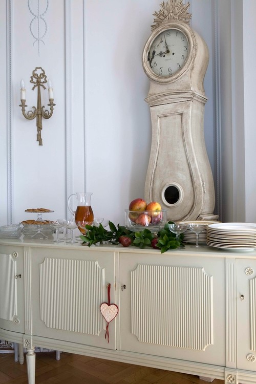
What is the style? Swedish or Belgium? What's the difference?
I like the space, but will a "muddy" neutral work in my home?
Probably not.
The inspiration photo's walls look lilac-and-gray--lovely, but this color won't be flattering in Rattlebridge's dark rooms.
Also, I'm horrified of trends.
Especially paint trends.
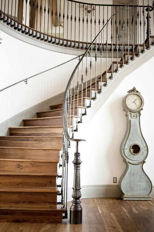
Same-toned metals and paint create a stunning backdrop in this foyer (see below). The iron railing harmonizes with gray trim
and a gray Mora clock; the richly knotted wooden floors add contrast and warmth.
and a gray Mora clock; the richly knotted wooden floors add contrast and warmth.
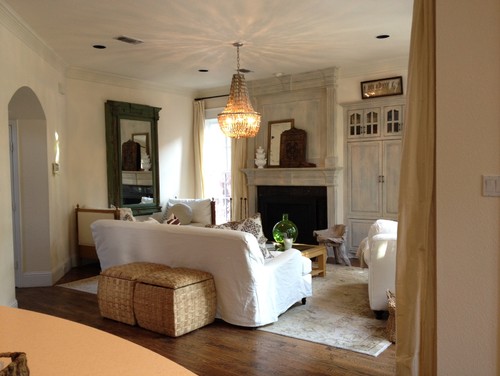
I like the sparkly chandelier, the slipcovers, the gray-painted armoire, and natural elements. But it looks as if several paint colors have been used (artfully) to achieve patina and layering. A green vase on the coffee table adds a hit of color.
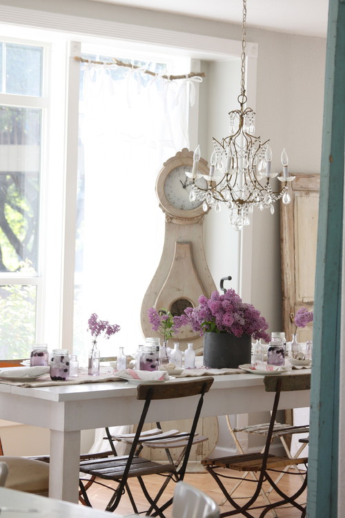
This white room becomes magical during the "Blue Hour."
A blue door opens into a room that's been layered with neutral paint. A sparkly chandelier and fresh flowers add light, color, and a delicate touch of bling. The straight-lined table and chairs give cohesiveness to the mix. Love the old door on the far wall and how it echoes the finish on the Mora clock and the floor. The darker chairs prevent a matchy-matchy look.
(Notice how a curvy branch was transformed into a drapery rod.)
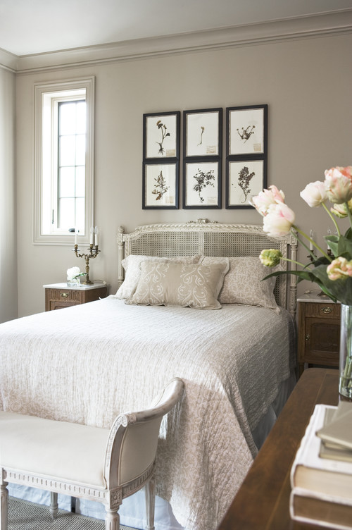
Black-framed botanicals lend gravity to this tone-on-tone room.
The wall color is slightly "dirty," adding instant patina.
After a stressful day, who wouldn't love to cuddle up in this bed with a book? The room works because of muted furnishings, interesting textures, and paint techniques. The walls, ceiling, and trim are all the same color -- Sherwin Williams "Loggia" (SW-7506) -- but in different finishes and concentration. The ceiling is 30% tint.
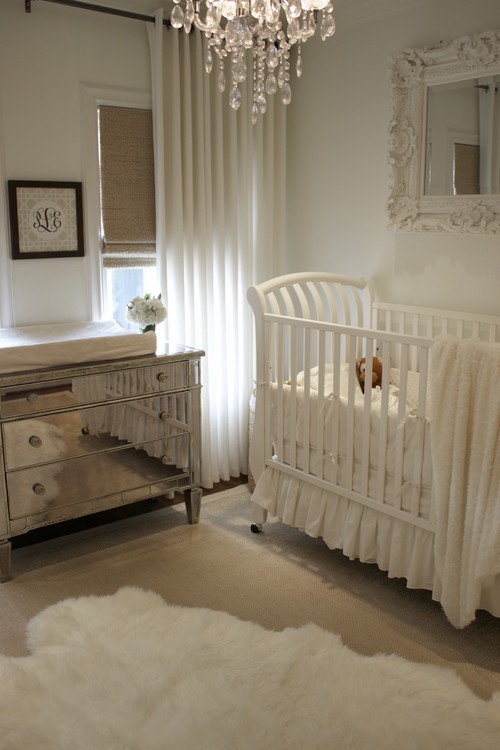
The paint colors in this upscale, elegant nursery
will work for grown-ups. The wall color is Ancestral 20-1 by Pratt & Lambert in semi-gloss; trim and woodwork are White Dove by Benjamin Moore, a designer's "go-to" trim color. Love how the mirror and mirrored chest reflect light from the chandelier. The sisal and roll-up blind add texture, though I wouldn't be brave enough to put sisal in a baby's room. The fluffy white rug brings the color white down to the floor--and it's soft.
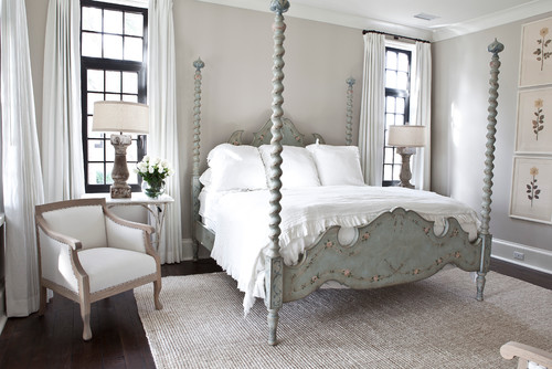
A painted bed takes center stage in another "dirty-colored" neutral bedroom. The sea grass rug brightens the space, yet it allows the dark wooden floor to peek at the edges . . . just like a picture frame.
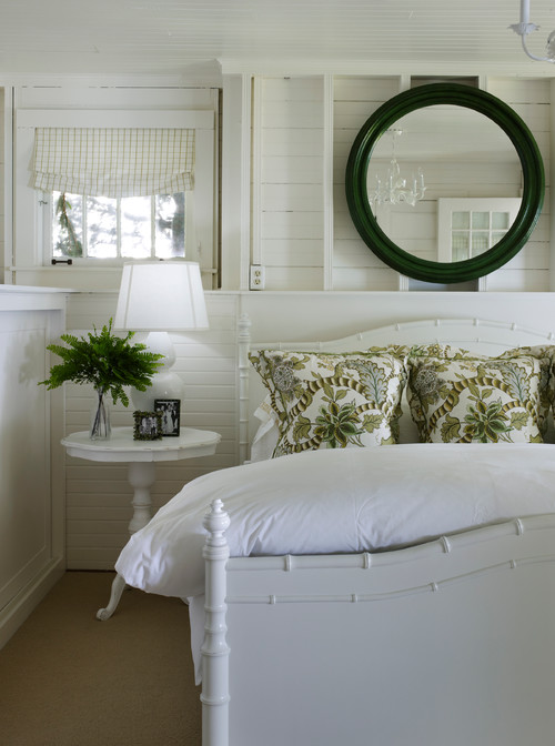
Details: soft, fluffy bedding, paired lamps, and floral prints.
Another tone-on-tone room. The upholstery and draperies echo the honeyed flooring. The wall color is "Owl Gray" by Benjamin Moore.
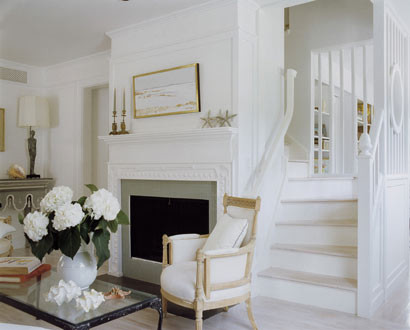
This room uses gray-green accents to knock down the austere white walls and woodwork. This space has a coastal vibe; but with different accessories, it could look Belgian.
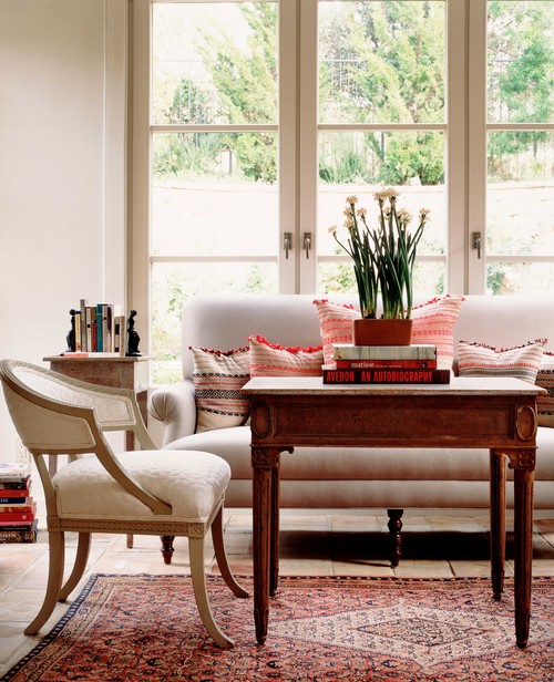
This is my favorite "white room."
It's classic. Never goes out of "style." The walls, trim, and upholstery provide a calm backdrop for a Persian rug and striped pillows. Trends will come and go, but if the homeowner wants a change, she can add a blue and white striped rug and blue-patterned/solid pillows.
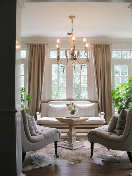
Beiges warm up the white walls and woodwork. Love how the greenery is balanced--and echoes the view. The white pillows on the sofa are subtly textured. The animal hide breaks up the monotony of the floor.
I would never grow tired of this room. It would be so easy to tweak the color scheme. Imagine a few muted tartan pillows during the holidays. Or ice blue pillows in the summer.
What would you add for autumn? Easter? Valentine's Day?
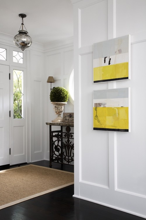
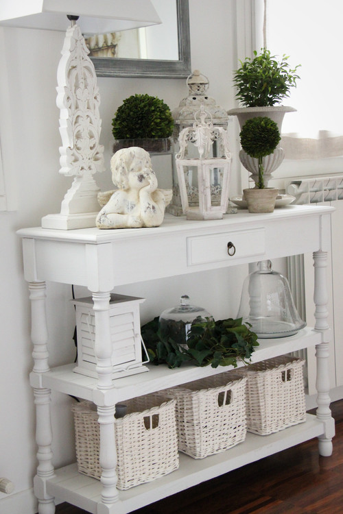
Elements that add elegance and warmth to a neutral foyer: White walls. Dark floors. A mercury glass lantern. Sisal rug. Dark iron table. A touch of green. And bold yellow art.
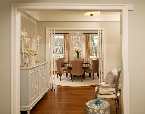
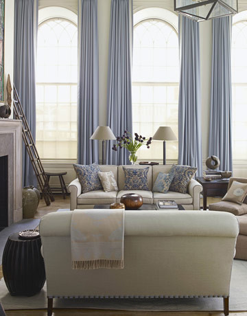
Periwinkle, cream, and rich sand come together to create a beautiful space. The draperies really make this room. But they also nail down the color scheme, unless you'd. be willing to change the window treatments every ten years or so. (I wouldn't.)
The lesson is:
If you love, love, LOVE a color, use it.
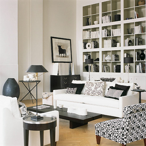
A parquet floor is the canvas for black and white furnishings.
Imagine this room with green topiaries...or a vase filled with yellow tulips. Two different looks.
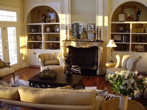
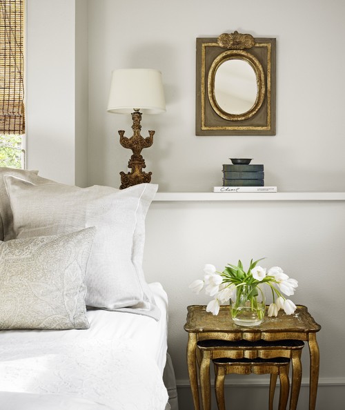
A touch of gilt adds color and gentle bling.
As with Goldilocks and the Three Bears, everything works better in threes. Love the trio of gold--tables, lamp, mirror.
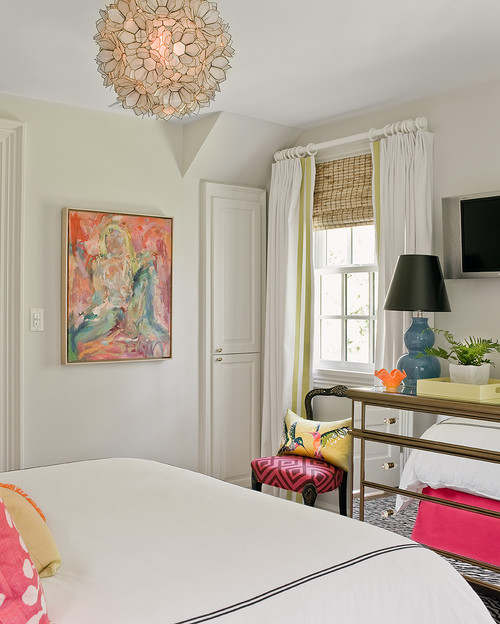
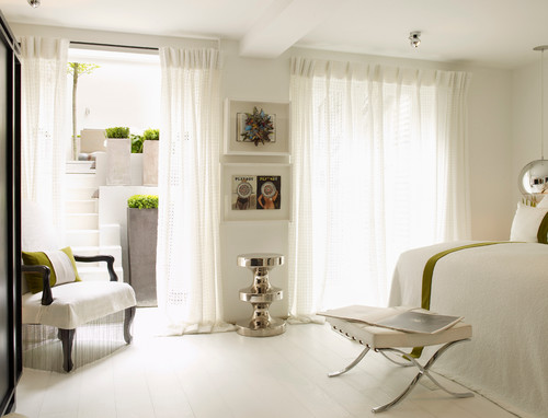
Hot pink and a touch of pea-green brings this white room to life.
Again, if you're working with a neutral palate, you can update a room without spending a fortune.
Here, you'd only need to switch the dust ruffle, and throw pillows; a slipcover could be added to the chair.
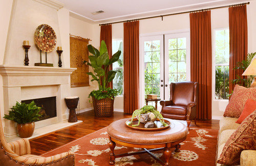
Another creamy backdrop with copper accessories.
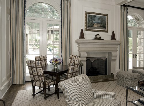
Cooler tones can be timeless and gorgeous. When the background is neutral, look how much fun you can have with patterns.
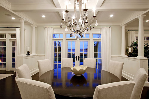
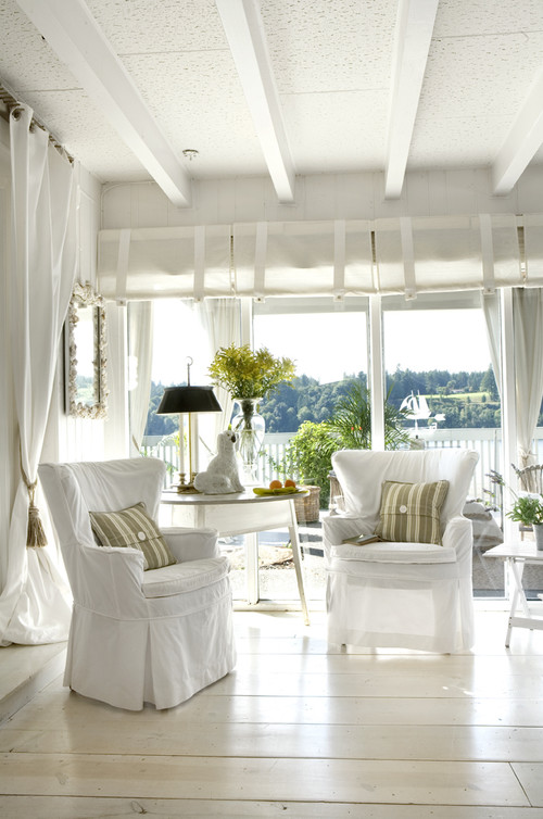
Here, the view is the focal point.
So why do I love a white room?
It's versatile.
By changing a few accessories, I can change my inner world.
Pantone's hot color for 2013 is green--you're already there if you have a white background.
(I'm proud that I even know this tidbit. However, it was an accident. Colors-of-the-year come and go, and I am clueless).
Green.
Who wouldn't love a color that can be found in the backyard?
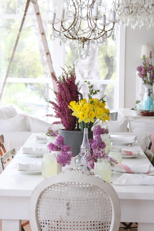
If you love to tablescape, neutrals are your best friend.
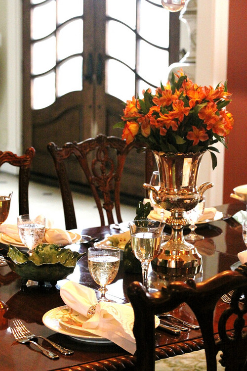
A tablescaping paradox: if your dishes are white, you can still be hemmed in by color.Even a pretty splash of tangerine can tire the eye after a decade. Or maybe not.
COLOR is like romance: very personal.
One woman's Moby is another's Edward Cullen.
My anonymous relative is still asking,
"Mlee, do you know what you are doing?"
The answer is no.
It will always be no.
But I know what I want, and that's 99% of decorating.
To know.
And to go for it.
Thanks for reading today's post.
See you at Foodie Friday.

.jpg)
.jpg)
.jpg)
.jpg)
.jpg)

No comments:
Post a Comment