
I've been thinking and thinking about neutral interiors.
I grew up with color; I still live with cheery bursts of orange and lemon. I don't want to live without bright hues,
but I am craving cream and wheat.

Okay, so what's the problem?
I don't want an anemic room.
My spirits would plunge in a drab environment.
I also don't want to make $mistakes$.
But I have questions.
Where does the home designer draw the proverbial line between vivid hues and neutrals? Is it even possible to achieve a colorful neutral space, or is that a contradiction?
And how much color can this scheme take before it collapses?
I'm not scared of neutrals. The poor little things are misunderstood.
I'm scared of myself and my "eye." Sometimes I just don't know when to quit. I forget the meaning of "restraint."
I do know that a quiet palette has quite a range,
and it certainly doesn't mean the absence of color.

But it does require subtlety and balance.

Neutral rooms can be, well, neutral.
All about texture and architectural elements.
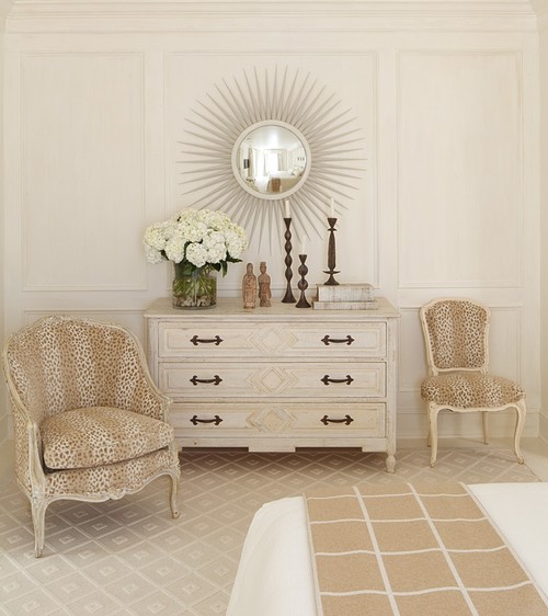
A monochromatic room can feel clean and calming.
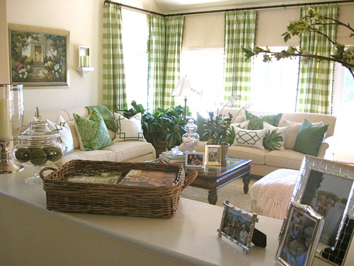
You can add a vibrant color, dashes of two other colors (same intensity), and surround them with creamy walls
and warm wood tones.
Neutrals can be fun for all ages.
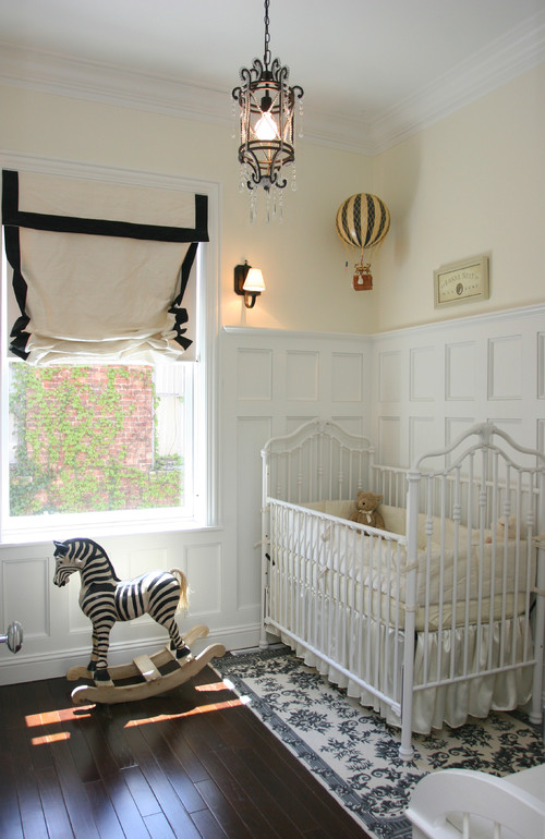
A neutral background allows design flexibility--as trends come and go, your room can always be refreshed by changing accessories..

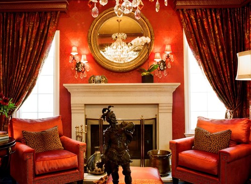
Yes, you can have a terra cotta rug.
Traditional Dining Room design by Charleston Interior Designer Linda McDougald Design | Postcard from Paris Home
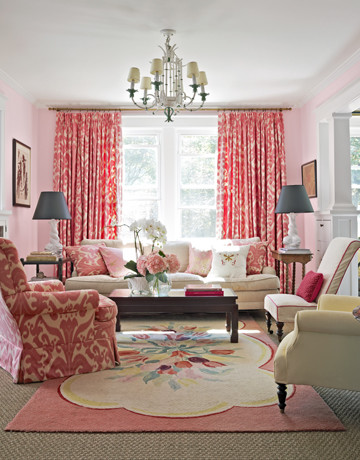
You can have turquoise.

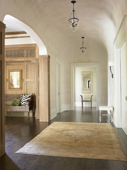
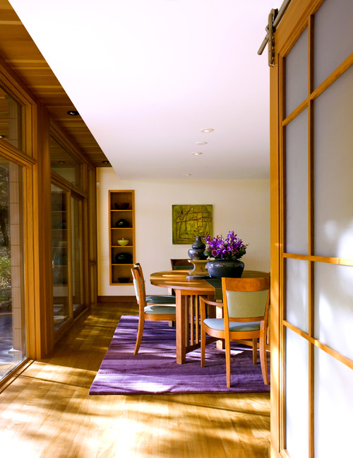
Traditional Entry design by Boston Architect Jan Gleysteen Architects, Inc
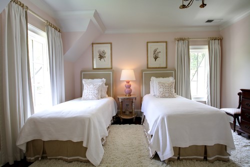
A quiet palette allows your furniture and architecture to shine.
A quiet palette allows your furniture and architecture to shine.

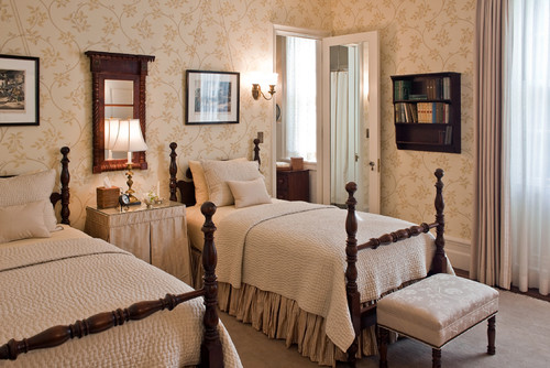
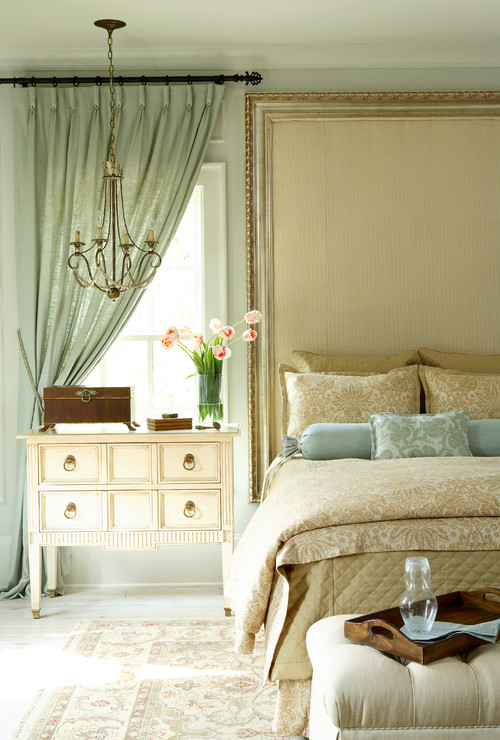
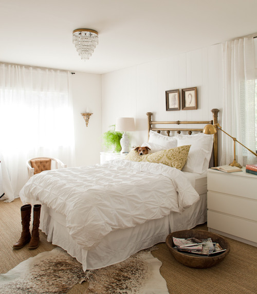
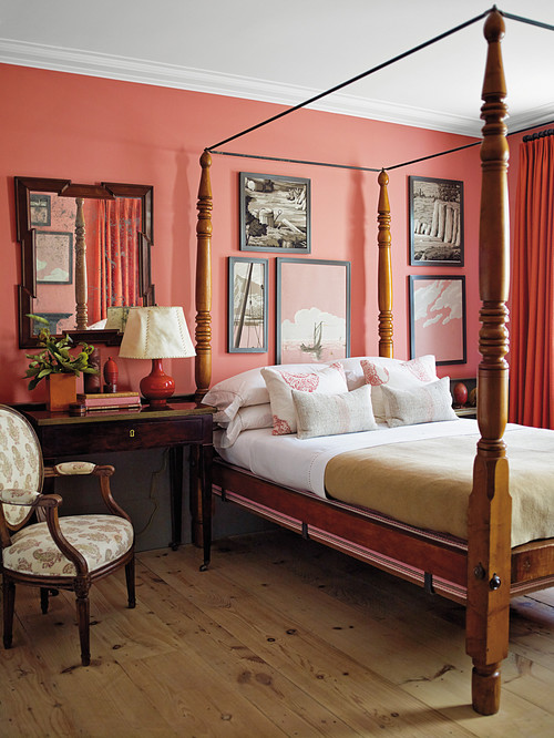
Traditional Bedroom design by Boston Architect Solomon+Bauer+Giambastiani Architects
Okay, fine. I get that part.
But what's the recipe?
The formula? 75% neutral + 25% color?
No? You mean there's no formula?
I've got to trust my instincts?
How much color until I goof?
Let's look at a spaces with--and without--color.
We'll start with something easy: a
bright blue chair with red accessories.
Now you see color. Now you don't.


This is another easy one.
A classic but colorless entrance.

Shall we add a dollop of red?
Why not.
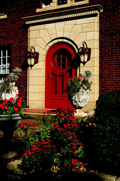
Wow. Big difference, huh?
Let's try it again.

Add calming blues, touches of gold, grounding bits of black.
[Black provides gravity for any space.]

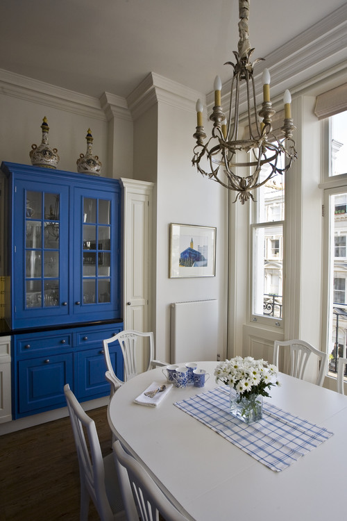
What about this Swedish style breakfast room?
Pretty bland, isn't it?

The addition of blue makes all the difference.
This one is harder.
My attention goes straight to the butterfly picture.
My attention goes straight to the butterfly picture.

Now, with color, my attention goes to the rug.

Here, we have a gray wall;
black and white art provides pattern and movement.
black and white art provides pattern and movement.

The addition of color really adds movement and depth.

Shall we keep going?
Come on, let's try a few more color/no color rooms.
Come on, let's try a few more color/no color rooms.


Contemporary Living Room design by Toronto Interior Designer Jennifer Brouwer (Jennifer Brouwer Design)


Color is beautiful, warm, classic.


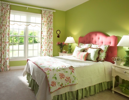
Traditional Bedroom design by San Diego Interior Designer Decorating Den Interiors - Susan Sutherlin


Do you need color in your life?
Do you crave neutral spaces AND color?

Social Bookmarking
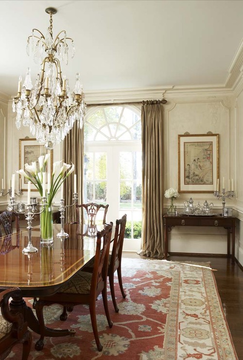
Top photo source: Houzz. Traditional Dining Room design by Minneapolis Interior Designer Bruce Kading Interior Design
No comments:
Post a Comment