
When you're remodeling, winter is a good time for armchair designing, and also to make long-range plans. The weather is cold and brittle, limiting the changes to indoors, and your careful plans will hopefully pave the way for cost-effective changes,
like, painting a dark blue study...

a lighter color.
.jpg)
Now that that our living room has also been painted a creamy white, I'm scrutinizing the architecture, trying to find ways to add sunlight, texture, and detail. But texture is not enough. A white room can look industrial without architectural elements: layers of crown molding, taller baseboards, trim on the mantel.
This is the original room as it appeared on Realtracs. The walls appear much brighter, but they were actually a deep beige; one wall was covered in grass cloth. As you can see, the room is boxy, a bit longer than it is wide. The 6'8" tall French doors open onto a covered porch, but the overhang makes this area dark.
.jpg)
Before the renovation, my younger son, Pigpen, reluctantly helped me rearrange the furniture that had kindly been left by the previous owner. We tried several arrangements. It was harder than I'd thought, because the room is "cut up" by so many openings--two French doors, the fireplace, and three doors (one leads to a powder room, which will be the subject of another RDiary).


Now, with a full-bore reno going on, the furniture has been pushed into the center of the room and covered with plastic.
The grass cloth is gone (I understand it's making a huge comeback, but this room is tight, and I didn't want the paper to compete with other elements). The walls have been painted (same color as the foyer and dining room).
The room (below) has pretty crown molding and standard baseboards. Mike, my contractor, and I discussed adding trim above and below. Baseboards will get higher. . .

. . . and so will door/window casings.

Also, Mike liked the idea of adding 8 foot doors (and skylights to the porch's roof), which will bring sunlight flooding into this gloomy space. Since I loved blowing out the kitchen ceiling (the best $3000 we ever spent--which including demo and reframing!!), Dr. Will and I were seriously considering blowing out the living room ceiling, too, which would mean sunlight would stream through the upper windows. Two itty bedrooms, no bigger than cartons of sherbet, would have to go.
Mike said it was doable, but it would reduce the square footage and, most importantly, it would be destructive.
So we've scratched that idea.
Mike Corley, our craftsman, will add detail
to the living room mantel.

I need to give the other Mike a detailed list because he's almost ready to start working on this room,. I need to make up my mind about these architectural details, so we can get bids/estimates.

Ideas are still churning.
It was Pigpen's idea to blow out the wall between the dining room and foyer, which brightened up those spaces
and made them feel larger.

Now Pigpen thinks we should blow out the wall between the living room and the kitchen/breakfast area, repeating the columns. I'll have to ask Mike if these walls are load-bearing,
but it seems like a good idea.


I've been studying other rooms, hunting for ideas.
Here's a white living room with a gorgeous mantel, trim, and a sparkling chandelier.
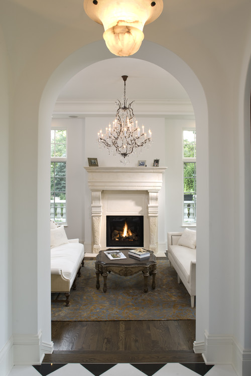
I like the cove trim--it's clean-lined and simple and would not overpower the space.

I shouldn't overlook the ceiling. A subtle design would be lovely.

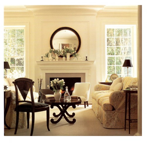
Here, we have a room that's similar to mine, architecturally speaking--the same brick fireplace and trim work. But they've added chair-railing and trim to resemble wainscoting. Since I've already added this to the dining area, I probably won't do this in the living room.
So I need to keep looking.
Contemporary Living Room design by Birmingham Interior Designer Dana Wolter
I love the wooden walls and the hefty trim above the doors. Just beautiful. This picture makes me long for a blue and white striped rug! Isn't it charming?
I love the wooden walls and the hefty trim above the doors. Just beautiful. This picture makes me long for a blue and white striped rug! Isn't it charming?

Traditional Living Room design by Atlanta Interior Designer The Design Atelier
This room has the vaulted ceiling that Will and I had envisioned; but I don't think we'd see a design payoff in our room.
This room has the vaulted ceiling that Will and I had envisioned; but I don't think we'd see a design payoff in our room.

Traditional Living Room design by San Francisco Interior Designer Amoroso Design
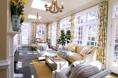
I found a photo of a kitchen/family room that has an open design.
It seems much bigger and brighter.
I found a photo of a kitchen/family room that has an open design.
It seems much bigger and brighter.

Another look at our wall.
I can visualize columns dividing these areas.

On the next Renovation Diary, I'll have to decide about the porch: I need to figure out if I want to screen it, glass in the area,
or leave it alone.
or leave it alone.

Because I can totally see this...

turning into this.
But that's the lovely part of winter--dreaming about sunlit spaces.
See you tomorrow with fussy, Victorian cupcakes when we celebrate the return of Downton Abbey's Season Three.
Top Photo Credit: Houzz. Traditional Living Room design by New York Architect Robin McGarry Interior Design

Social Bookmarking
No comments:
Post a Comment