Some places are beautiful and easy going.
But have you ever been faced with a difficult room?

A room that laughed in your face or spit in your eye?
A room with shadows and shifting pools of light.
A room with shadows and shifting pools of light.
A room that would not submit to paint, much less your dreams.
Dr. Will knew this room was trouble the first time he saw it,
though he couldn't (or wouldn't) articulate why.

This room has three windows, three mirrors, pickled cabinets, black-brown-tan speckled counters, a slightly coppery/beige tile floor with black inserts, a tub surround with beige and navy tile, and yellow walls. It should've been easy to decorate.

Let me begin by saying that I love the cabinets, though I wouldn't object to painting them. They're well-built, and I love the drawer space. They've been paired nicely with the floor and counters--a perfect match, really. But that wall color worried me.
I told myself to wait. (I didn't like the tub, either, but I was told it was a pricey therapeutic thing, so it will stay. As will the tiles--whoever installed them knew what they were doing.)
I've been waiting for over a year, and all the while I was thinking.
The walls were easily remedied, I told myself; however, I underestimated the power of the diverse tile colors, along with the surprisingly harsh nature of the light and other reflective surfaces.
Lighting can be just as assertive as tile color.I knew the wall color had to go, along with the window treatments,
but I got distracted by the trim.
+(2)+-+Copy+-+Copy.jpg)
SW's Caviar went on a tub panel. I was home with the flu and got updates via email and phone. It seemed as if the Caviar was a smart looking match for the black diamonds in the tile floor. But when I finally dragged myself over to the farm, I realized that Caviar was too weighty and masculine. Pretty, but wrong in this light
and in this space. So I looked through my fan decks and scoured Pinterest (my favorite hang-out).
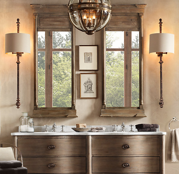
I found a beautiful photo on Houzz that sparked my imagination. It's not really the look I'm going for (a little formal), but I love the wall color; the beige flooring was a little similar to mine (minus the orange streaks and assertive black diamonds), so I thought it could work in my space. I'd love to add a little definition to the tub area--an arch or something to separate it from the sink area.

It's strange how the little black diamonds on my floor completely derailed the Palladian Blue.
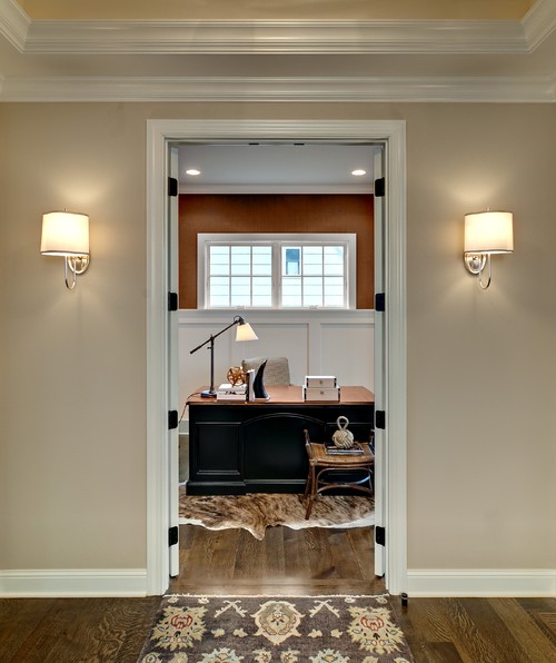
Here's another similar color scheme from Houzz.
Pretty but way too formal (my husband is going to freak--he loves formal things) for me. But I wondered if the wall color would cancel the orange.
Pretty but way too formal (my husband is going to freak--he loves formal things) for me. But I wondered if the wall color would cancel the orange.

I tested SW Moderate White (lower left), SW Creamy (upper left) and BM Palladian Blue (far right). Palladian looked blue-green on the paint chip. But it was baby blue in my bath.

Everyone agreed that Moderate White was too white. But I just didn't believe it! This color is the paint world's version of a creamy vanilla ice cream cone, mixed with a hint of caramel.
It's a beautiful color. I wanted it to work, so I enlisted Bandwidth's help and we kept painting.
It's a beautiful color. I wanted it to work, so I enlisted Bandwidth's help and we kept painting.
.jpg)
Now let's step back.
We have Moderate White on one panel and Caviar on the other.
(The rag on the floor is from an oopsy-daisy spill--we quickly cleaned it, so no harm done!)
What do you think of this northern light? I do love light, but I don't like what it's doing to Moderate White or the other paint colors.
The small ledge of granite, if it's granite, seems to clash with the tile, not to mention those navy blue inserts.

Why isn't this working?
What am I missing about this room?
It's talking, but I can't understand the lingo.
.jpg)
I'm starting to wonder if the coppery valance
and yellow walls are confusing my eye.
and yellow walls are confusing my eye.
.jpg)
Let's try a dab of Moderate White again.
.jpg)
On the very bottom swatch, you can see the creaminess of the paint. It's not white at all. Yet the room is sucking the life out of that color.
.jpg)
One last hurrah--Moderate White and Caviar.
Maybe it's the mirror that's confusing me.
Maybe it's the mirror that's confusing me.
.jpg)
I love the color of this room.

Come to think of it, this is the look I want. But can I do it with what's alread in place? Without ripping out anything?
The above color reminds me of Macadamia, a deeper version of Moderate White, and I could glaze the cabinets with Thatch Brown, an even darker shade on the Moderate White strip. Bandwidth is painting a sample right now, so I will soon know how Macadamia holds up to the light--and if the overall result is too beige. I'm not sure I will love that; but this room is offering limited choices.
Here's an example of Macadamia.
And here it is again in a brighter space.

I thought about trying Wythe Blue, but halfway to the paint store, I turned around--I just knew it woudn't work. Not with all of those weird beige/navy/black/whatever tiles.
(Just for the record, my contractor, Mike Cox, knows a way to paint the navy tiles beside the tub, so this color will soon be gone.)
For now, the bathroom wins.
It is laughing in my face and high-fiving itself.
It is laughing in my face and high-fiving itself.

Credit: Will West
I am totally out of inspiration.
Argh, argh. Argh.
If this was your bathroom, or you were the designer of this room, what would you do?
What am I overlooking and/or not understanding about color and tones I feel snowblind.
See you tomorrow evening for Foodie Friday, and the winner of the $100 Amex gift card will be announced--there's still time to enter (deadline is midnight tonight, central time).
No comments:
Post a Comment